Writing Task 1

  • The chart below shows the percentage of adults of different age groups in the UK who used the Internet everyday from 2003-2006. Summaries the information by selecting and reporting the main features and make comparisons where relevant.

    The given column graph illustrates the percentage of adults of different age groups using the Internet between 2003 and 2006, in the Great Britain. The over 65s had the least percentage of Internet users.

    The main users of the Internet were young adults aged between 16 and 24 years. In 2003 and 2004, they shared the same percentage, which was 80%. In 2005, this figure increased significantly to 100%, but decreased slightly to 90% in the next year.

    We can see from the chart that all the age groups experienced an upward trend as far as their daily use of the Internet is concerned. In the 25-44 group, there was a gradual growth in the percentage, from 50% to 80%, between 2003 and 2006. There were similar increases for the 45 to 54 year olds, rising from 60% in 2003 to 80% in 2006. As for the other two groups, although the percentages had minor fluctuation, the overall trend was upwards.

    Overall, adults between 16 and 44 showed the greatest usage of the Internet and the users grew with time regardless of their age.

  • The chart below shows the percentage of whole world population in four countries from 1950 to 2000, with projections till 2050. Summaries the information by selecting and reporting the main features and make comparisons where relevant.

    In 1950, China accounted for a little over a quarter of the world’s population. Although it decreased to a little under a quarter, it was still the highest in 2000, compared to the other three countries. It is estimated that the population of China will continue to drop and would reach approximately19% by 2050.

    India showed an opposing trend to China. The population in India in 1950 was 15%, which was considerably lower than that of China. However, the population increased moderately to 19% by 2000 and is further expected to grow and reach nearly 20%, which would be the highest among the given countries by 2050.

    When it comes to the population of the USA and Japan, both showed a decrease from 1950 to 2000. It is predicted that the percentage will remain the same in the USA, whereas in Japan, the population is likely to keep falling till 2050.

    Overall, Japan had the least population in the given period, and the population is expected to decrease to approximately 3% by 2050.

  • The chart below shows the expenditure on three categories among different age groups of residents in the UK in 2004. Summarize the information by selecting and reporting the main features and make comparisons where relevant.

    The given column graph compares the amount of money spent by five age groups of the British citizens on three different items, in the year 2004. It is interesting to note that the spending on food and drinks was the least by the under 30s, and the highest by the above 76 age group.

    It is noticeable that the largest proportion of spending went on food and drinks in most age groups, except for the under 30s and those between 61 and 75 years of age. Expenditure on restaurant and hotel was almost similar among all age groups below 60 years. They spent 12-14% on this sector. The 61-75 and the 76+ age groups spent 2% and 7% respectively on restaurant and hotel. The under 45s spent lesser on entertainment than on restaurant and hotel, but the vice versa was true for all the other given age groups. The 61-75 year olds, showed the highest discrepancy in their spending on these two areas. They spent 2% and 23% on restaurant and hotel, and entertainment respectively.

    Overall, it is observed that as age advanced, the spending priorities of people changed. Older age groups spent more on food and drink and entertainment. However, the 76+ age group did not give much importance to entertainment.

  • The charts below show the number of working hours per week, in industrial sector, in four European countries in 2002. Summarize the information by selecting and reporting the main features and make comparisons with relevant.

    In France, approximately half the workers worked for 31-35 hours per week. The percentage of people who worked for 36-40 hours and 46-50 hourswas 35% and 20% respectively. The figures for the rest of the working hours accounted for around 10% workers each.

    Denmark and Sweden witnessed the highest proportion of people working for 36- 40 hours, which was quite different from that of France. The second and the third place came from 31-35 hours and 41-45 hours workers (25% and 10% in Denmark; 35% and 30% in Sweden). The proportion of people working for the remaining hours was higher in Denmark than in Sweden.

    It is interesting to note that in the UK, the percentage of people working 50+ hours was the maximum. Almost 50% worked 36-40 hours per week.

    Overall, France was a country where the people worked for the least hours, where as the Swedish people spent the most time on work among the people from four different countries.

  • The chart below shows the aid from six developed countries to developing countries from 2008-2010. Summarize the information by selecting and reporting the main features, and make comparisons where relevant

    The given column graph illustrates the amount of aid given by six developed countries from 2008 to 2010, measured in billions of dollars.

    The US provided the most aid in all three years and despite a slight drop in 2009 from 22 to 20 billion dollars in 2009, the figure rose to $25 billion in 2010. Germany, UK and Japan, were other three major donors, with figures ranging between 10 and 15 billion dollars. It is interesting to note that Germany increased its aid continuously over the years, but the aid from the other two showed fluctuations. The aid from Netherlands and Sweden was always under $10 billion, yet the three years saw similar changes in the figures.

    Overall, the US contributed the most in supporting the developing world. Whilst the aids of most countries fluctuated in three years, Germany was the only country with consistent increases.

  • The chart below shows the total number of minutes (in billions) of telephone calls in the UK, divided into three categories, from 1995- 2002.

    The bar chart compares the amount of time spent by people in the UK on three different types of phone call between 1995 and 2002.

    It is clear that calls made via local, fixed lines were the most popular type, in terms of overall usage, throughout the period shown. The lowest figures on the chart are for mobile calls, but this category also saw the most dramatic increase in user minutes.

    In 1995, people in the UK used fixed lines for a total of just over 70 billion minutes for local calls, and about half of that amount of time for national or international calls. By contrast, mobile phones were only used for around 4 billion minutes. Over the following four years, the figures for all three types of phone call increased steadily.

    By 1999, the amount of time spent on local calls using landlines had reached a peak at 90 billion minutes. Subsequently, the figure for this category fell, but the rise in the other two types of phone call continued. In 2002, the number of minutes of national / international landline calls passed 60 billion, while the figure for mobiles rose to around 45 billion minutes.

  • The graph below shows the percentage of dependents in 2000 and the predicted figures in 2050 in five countries, and also gives the world average. Summaries the information by selecting and reporting the main figures and make comparisons where relevant.

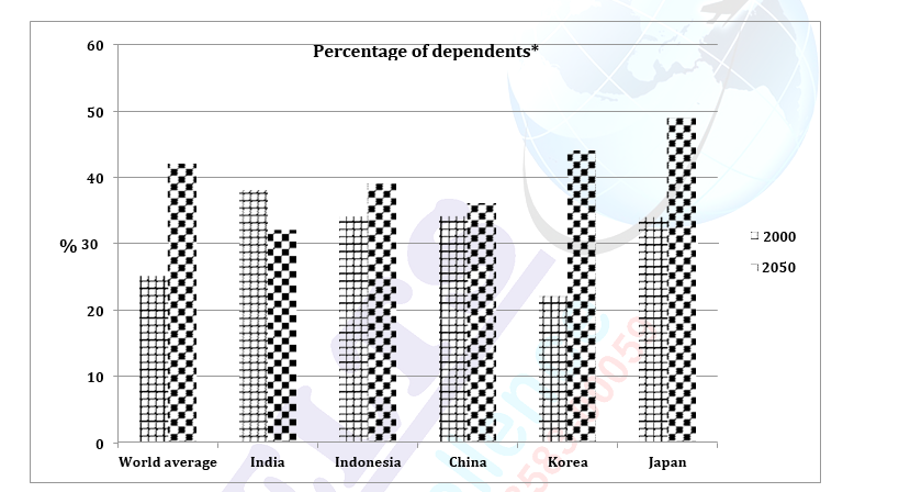
    (Dependents: Children below 15 or adults above 65)

    The given column graph illustrates the percentage of dependents (children below

    15 or adults above 65) in five countries in 2000 and also gives projections for 2050. It also depicts the world average in the given two years.

    In 2000, India had the maximum percentage of dependents (38%), with Japan, Indonesia and China following closely behind with around 34% of dependents. Korea had the least percentage of reliant people (22%). The overall world population of children below 15 and adults over 65 was 25%.

    Looking into the future, an increase in the population of dependents is predicted for Indonesia, Korea, China and Japan. In contrast, in India the needy population is thought to fall from 38% to 32%. In Korea the population is expected to double by 2050, from 22% to 44%. Approximately 15% rise in such population is predicted for Japan, whereas China is thought to show the least increase (2%). The world average of the dependents is expected to go up from about 25% to nearly 42%.

    Overall, the percentage of dependents is expected to decrease in India whereas in other four countries it is projected to increase.

    (Note the language for the future and the synonyms for dependents)

  • The chart shows the information relating to people within 15-minute drive service in a particular region in UK. It also compares the people living in urban areas and people living in rural areas. Write a report for a university lecturer describing the information given below.

    The given bar graph compares the access to medical, educational and postal services by the city and countryside people in a specific region in the United Kingdom. Overall, it can be seen that almost all urban people are within fifteen- minute drive to all these mentioned services.

    Cent-percent urban and rural people have access to medical facilities. They are all within fifteen minutes drive to a doctor. Similarly, secondary school can be reached within 15 minutes by all residents of villages and cities. All city people have a post office in their propinquity. However, five per cent of villagers have to drive more than fifteen minutes to avail postal services. The biggest discrepancy lies in primary school facilities. Only sixty five percent of villagers have a primary school within a quarter of an hour drive, where as the remaining, approximately, one third inhabitants of countryside have to drive their children to far-off schools.

    Overall, the rural and urban communities have similar access to medical, postal and secondary school facilities but only about a third of villagers do not live close to a primary school.

  • The graph below shows the percentage of adults according to age and gender who do not do any physical activity in Australia. Summaries the information by selecting and reporting the main features and make comparisons where relevant.

    The given column graph compares the percentage of men and women of seven different age groups who lead a sedentary life in Australia. It can be clearly seen that except for the 45 to 64 year olds, all other age groups have more females than males who do not do much physical activity.

    The 15-24 year age group is the most active with only about 14 and 17 % men and women respectively who don’t do much physical activity. The 25-34 age groups have a little more percentage of people following a leisurely way of life. As age advances the percentage of easy-going men and women also is seen to be on the rise, with the exception of the 65-74 age group. Surprisingly, in this age group the number of males and females doing no physical activity is lesser than that of the 55-64 age groups. However, the 75+ age group has the maximum number of both genders doing no physical work.

    Overall it is clear that as age goes up more and more people start leading physically inactive lives except for the 65-74 year olds, and in most age groups more females than males lead sedentary lives.

  • The graph below shows the result of a survey of young people in four European countries on the most effective solution of global warming. Summaries the information making comparisons where relevant

    The given column graph elucidates the outcome of a survey as to the best solution of global warming among the people of four European countries, which are Portugal, Spain, Italy and the Netherlands. It is clear from the graph that lifestyle changes were rated as the best solution by the maximum youth of all the countries.

    50% of the Portuguese young people rated lifestyle changes as the best solution for global warming. Government regulations and environmental issues were considered the best ways to solve global warming by 20% and 17% respectively. The maximum Spanish young generation also was of the view that lifestyle changes were the most effective solution but their percentage was lesser than that of the Portuguese in this respect. 17% and 20% young people of Spain rated government issues and environmental factors as the best solution. The overall trend of the Spanish, the Italian and the Dutch youth was the same for all the factors with minor differences in percentage.

    Overall, only a small minority of the youth of all the countries opined that none of these factors could help reduce global warming.